PennyWorks Web App
Designed a consumer investment platform from the ground up: web app, admin panel, and brand foundations, with a consistent focus on frictionless user experience through a full product pivot.
CompanyFintech startup
4-person core team
My RoleSolo designer
TimelineMay 2021 ~ June 2022
Overview
Context and Starting Point
PennyWorks was an investment platform offering users higher yields on US dollars through collateralized digital asset lending. The founders had a clear product vision but an aggressive timeline. They believed the work required was drafting frames for developers to build from, and were resistant to investing time in brand or UX foundations.
There was no existing brand, no design system, and no documented product requirements. My first task was convincing the founders that the groundwork mattered: in fintech, a product asking users to trust it with their money needs to feel considered from the first screen.
Before wireframing, I ran a market survey with 388 respondents to understand what it would take for everyday users to trust a service like Pennyworks. The data showed user hesitation was primarily an information gap, not a rejection of the concept. Fees, APY transparency, and plain-language explanation of how the service worked were the three things people needed the most. This became the lens I used to sequence information across the product.
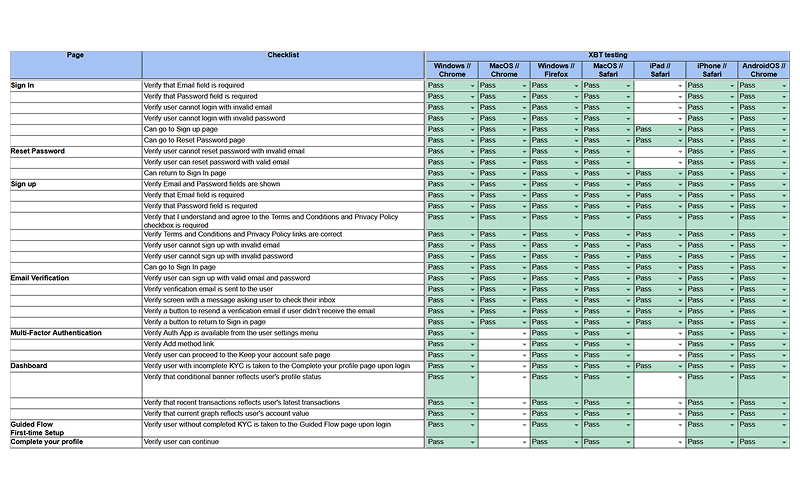
My scope covered the full product lifecycle: market research, web app UX and UI, admin panel design, contractor selection and oversight, project coordination, QA and regression testing, marketing website redesign, and design documentation.
brand contractor oversightMarketing website redesign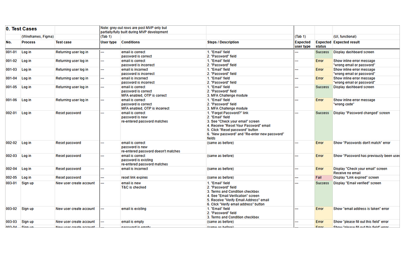
Project coordinationWeb app UIQA and regression testingAdmin panel design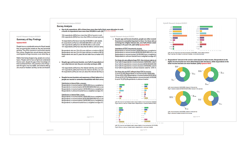
Market researchWeb app UX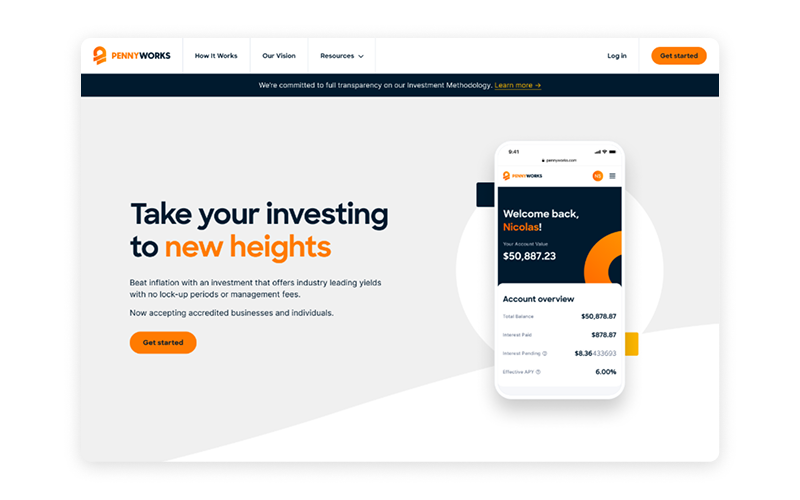
The Pivot
In July 2021, New Jersey sued BlockFi over its interest-bearing accounts, and SEC published the outcome on this lawsuit in early 2022, signaling a broader regulatory shift affecting crypto lending products.
As a result, PennyWorks changed its offering from Regulation A to Regulation D: from a retail product open to any user, to one restricted to US-based accredited investors only.
The target users changed, the compliance requirements changed, and the KYC process had to be rebuilt around a new identity verification provider. But the design priority didn't change. The experience still needed to feel straightforward and trustworthy, now for a more sophisticated audience with higher expectations.
Redefining the Scope
#1
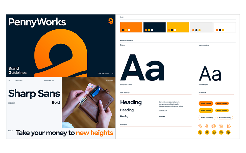
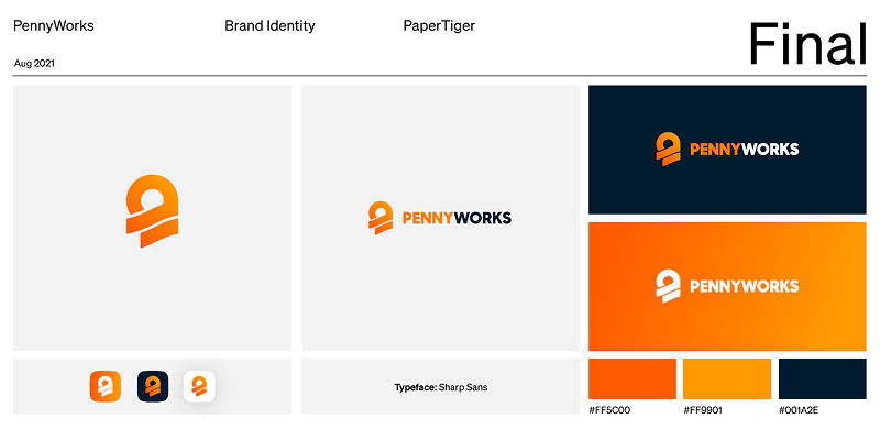
Establish brand foundations before finalizing the product
The founders wanted to ship quickly and treat brand as secondary.
Pointing how important first impression is for new businesses, I pushed back and convinced the founder to bring on contractors for visual identity and brand narrative before development was finalized, giving the product a coherent foundation at launch.
#2
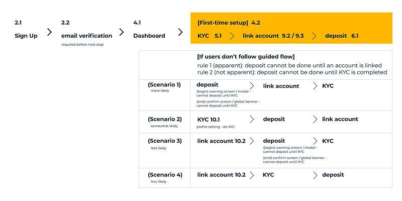
Reorder onboarding from bank link first to KYC first
Early onboarding linked a bank account before completing KYC, partly to use Plaid's autofill to ease data entry.
We reversed this for launch. Placing KYC first aligns with how every competitor structures the flow, and it avoids the discomfort of Plaid pre-filling personal data before a user fully understands what they've consented to.
#3
Rebuild KYC around the new compliance requirement
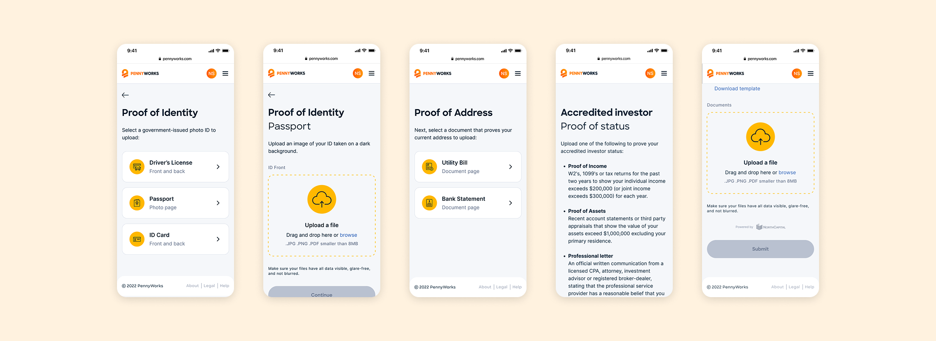
Switching from Reg A to Reg D meant replacing our identity verification provider and adding accredited investor proof as a mandatory step.
Rather than patching the existing flow, we rebuilt the KYC sequence from scratch to absorb new requirements cleanly, including country of residence gating and US domicile verification.

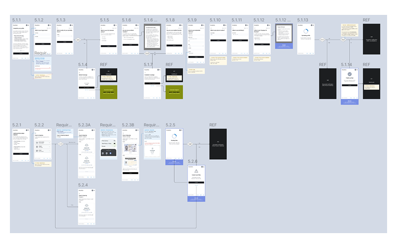
Mapping User Flow
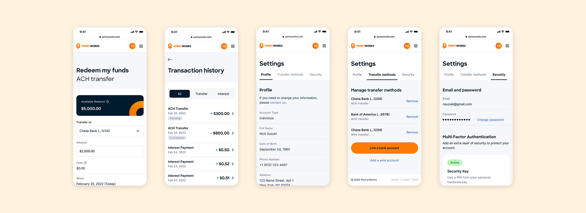
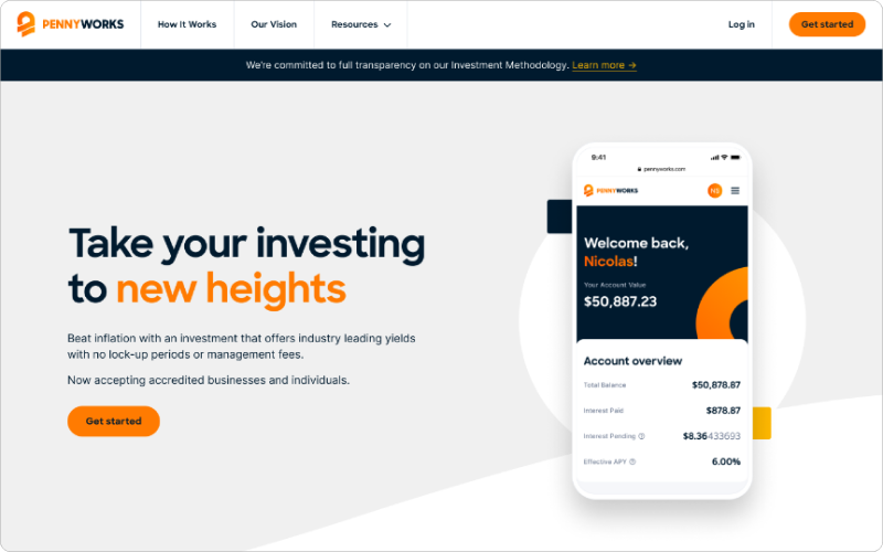
New users complete onboarding in a single linear path: account creation, KYC verification, and first deposit. Each stage is broken into small bites so the information load is manageable at every step. Returning users go directly to their dashboard to fund, redeem, or manage their account.
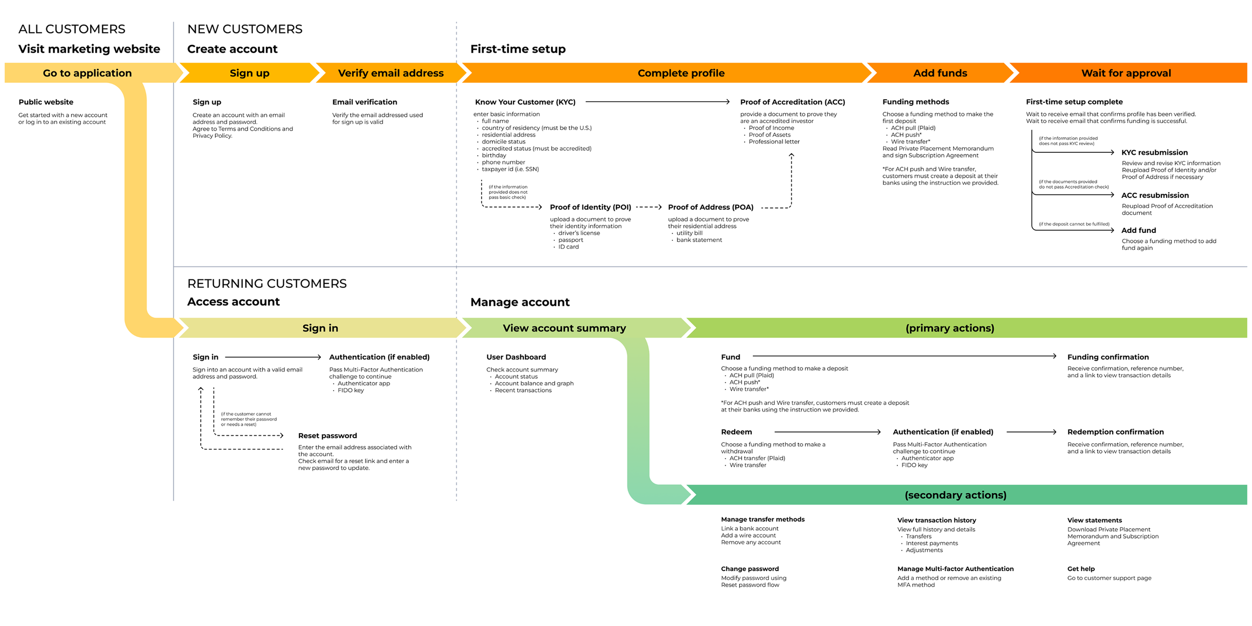
End-to-End User Flow DiagramFinal Product
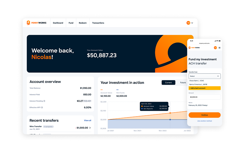
The web app mirrors familiar patterns from conventional banking while making clear how PennyWorks differs. Familiarity lowers the learning curve, and the distinction builds confidence in what the product actually offers.
I designed the app using mobile-first approach to maintain clarity across every screen size.
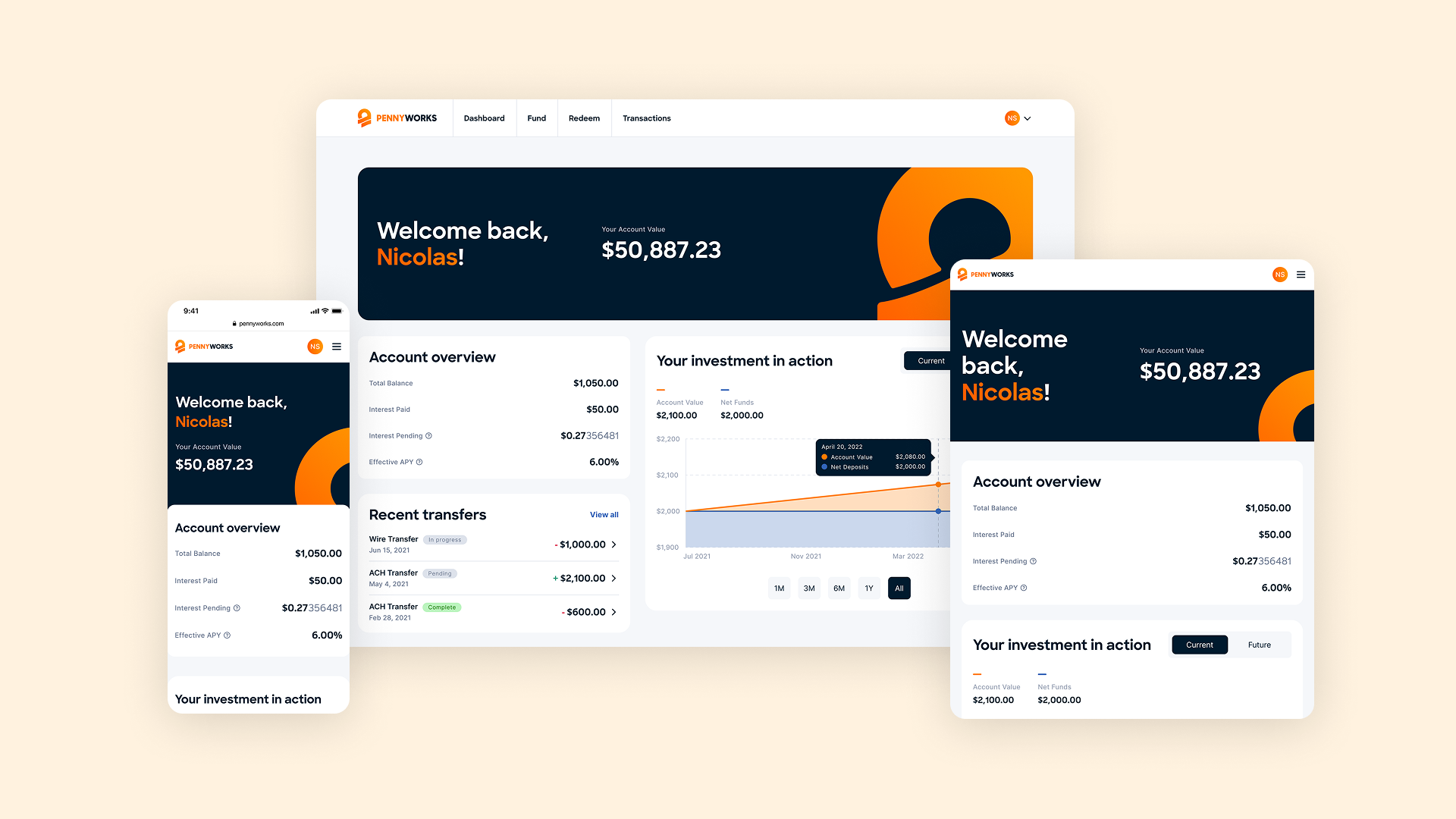
Account Dashboard

Sign in / Sign up
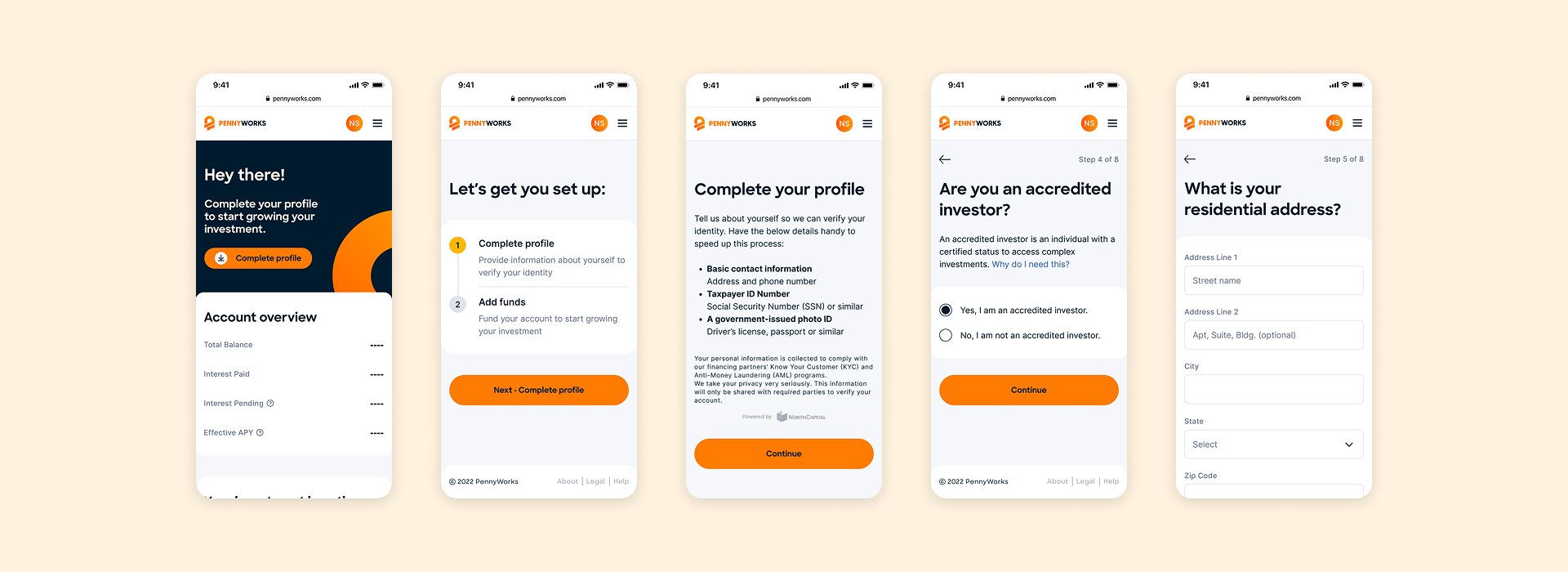
Onboarding

Add Funds
Redeem Funds, Transactions, and Settings
Extended Products
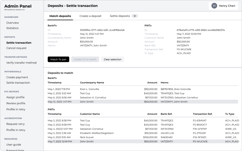
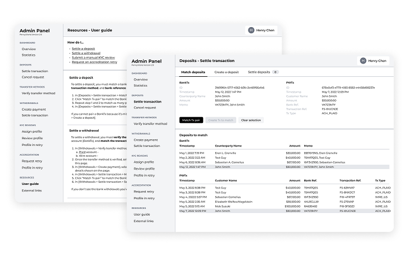
Admin Panel
Admin Panel was built alongside the web app to give the founding team visibility into KYC review status, transaction activity, and account management. It was designed for a non-technical internal team of four.
Marketing Website
Impact
At the forefront of regulatory changes, PennyWorks provided a frictionless app where alpha users could fully onboard under 10 minutes with first deposit funded.
Reflection
The product worked. The onboarding was frictionless, the brand was coherent, and the design held up through a full regulatory pivot. But a well-designed product still depends on the conditions around it.
The release coincided with a period of intense regulatory scrutiny across the crypto industry. Without a cold-reach acquisition strategy, growth stalled after the initial handful of investors. Regulatory uncertainty did the rest.
In hindsight, the team needed a project manager earlier, a phased development plan, and a beta release before the product was fully polished. A functional product with no users isn't a finished product. This lesson shaped how I approached Hashnote: closer to the business, earlier in the process, and with more focus on what gets clients in the door.